What Are SHAP Values?
SHAP (SHapley Additive exPlanation) values use game theory concepts to explain how each feature influences machine learning forecasts. They’re particularly useful when working with exogenous (external) variables, letting you understand contributions both at individual prediction steps and across entire forecast horizons. SHAP values can be seamlessly combined with visualization methods from the SHAP Python package for powerful plots and insights. Before proceeding, make sure you understand forecasting with exogenous features. For reference, see our tutorial on exogenous variables.How to Use SHAP Values for TimeGPT
Install SHAP
Install the SHAP library.Step 1: Import Packages
Import the necessary libraries and initialize the Nixtla client.Step 2: Load Data
We’ll use exogenous variables (covariates) to enhance electricity market forecasting accuracy. The widely known EPF dataset is available at this link. It contains hourly prices and relevant exogenous factors for five different electricity markets. For this tutorial, we’ll focus on the Belgian electricity market (BE). The data includes:- Hourly prices (y)
- Forecasts for load (Exogenous1) and generation (Exogenous2)
- Day-of-week indicators (one-hot encoded)
| unique_id | ds | y | Exogenous1 | Exogenous2 | day_0 | day_1 | day_2 | day_3 | day_4 | day_5 | day_6 |
|---|---|---|---|---|---|---|---|---|---|---|---|
| BE | 2016-10-22 00:00:00 | 70.00 | 57253.0 | 49593.0 | 0.0 | 0.0 | 0.0 | 0.0 | 0.0 | 1.0 | 0.0 |
| BE | 2016-10-22 01:00:00 | 37.10 | 51887.0 | 46073.0 | 0.0 | 0.0 | 0.0 | 0.0 | 0.0 | 1.0 | 0.0 |
| BE | 2016-10-22 02:00:00 | 37.10 | 51896.0 | 44927.0 | 0.0 | 0.0 | 0.0 | 0.0 | 0.0 | 1.0 | 0.0 |
| BE | 2016-10-22 03:00:00 | 44.75 | 48428.0 | 44483.0 | 0.0 | 0.0 | 0.0 | 0.0 | 0.0 | 1.0 | 0.0 |
| BE | 2016-10-22 04:00:00 | 37.10 | 46721.0 | 44338.0 | 0.0 | 0.0 | 0.0 | 0.0 | 0.0 | 1.0 | 0.0 |
Step 3: Forecast with Exogenous Variables
To make forecasts with exogenous variables, you must have future data for these variables available at the time of prediction. Before generating forecasts, ensure you have (or can generate) future exogenous values. Below, we load future exogenous features to obtain 24-step-ahead predictions:| unique_id | ds | Exogenous1 | Exogenous2 | day_0 | day_1 | day_2 | day_3 | day_4 | day_5 | day_6 |
|---|---|---|---|---|---|---|---|---|---|---|
| BE | 2016-12-31 00:00:00 | 70318.0 | 64108.0 | 0.0 | 0.0 | 0.0 | 0.0 | 0.0 | 1.0 | 0.0 |
| BE | 2016-12-31 01:00:00 | 67898.0 | 62492.0 | 0.0 | 0.0 | 0.0 | 0.0 | 0.0 | 1.0 | 0.0 |
| BE | 2016-12-31 02:00:00 | 68379.0 | 61571.0 | 0.0 | 0.0 | 0.0 | 0.0 | 0.0 | 1.0 | 0.0 |
| BE | 2016-12-31 03:00:00 | 64972.0 | 60381.0 | 0.0 | 0.0 | 0.0 | 0.0 | 0.0 | 1.0 | 0.0 |
| BE | 2016-12-31 04:00:00 | 62900.0 | 60298.0 | 0.0 | 0.0 | 0.0 | 0.0 | 0.0 | 1.0 | 0.0 |
| unique_id | ds | TimeGPT | TimeGPT-hi-80 | TimeGPT-hi-90 | TimeGPT-lo-80 | TimeGPT-lo-90 |
|---|---|---|---|---|---|---|
| BE | 2016-12-31 00:00:00 | 51.632830 | 61.598820 | 66.088295 | 41.666843 | 37.177372 |
| BE | 2016-12-31 01:00:00 | 45.750877 | 54.611988 | 60.176445 | 36.889767 | 31.325312 |
| BE | 2016-12-31 02:00:00 | 39.650543 | 46.256210 | 52.842808 | 33.044876 | 26.458277 |
| BE | 2016-12-31 03:00:00 | 34.000072 | 44.015310 | 47.429000 | 23.984835 | 20.571144 |
| BE | 2016-12-31 04:00:00 | 33.785370 | 43.140503 | 48.581240 | 24.430239 | 18.989498 |
Step 4: Extract SHAP Values
After forecasting, you can retrieve SHAP values to see how each feature contributed to the model’s predictions.Step 5: Visualization with SHAP
Visualizing SHAP values helps interpret the impact of exogenous features in detail. Below, we demonstrate three common SHAP plots.Bar Plot
Use a bar plot to see the average impact of each feature across predictions: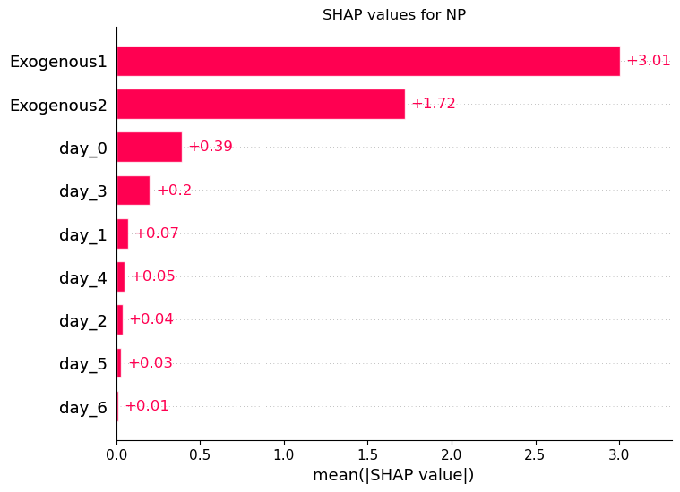
Waterfall Plot
A waterfall plot shows how each feature contributes to a single prediction step. Here, we select the earliest date for illustration: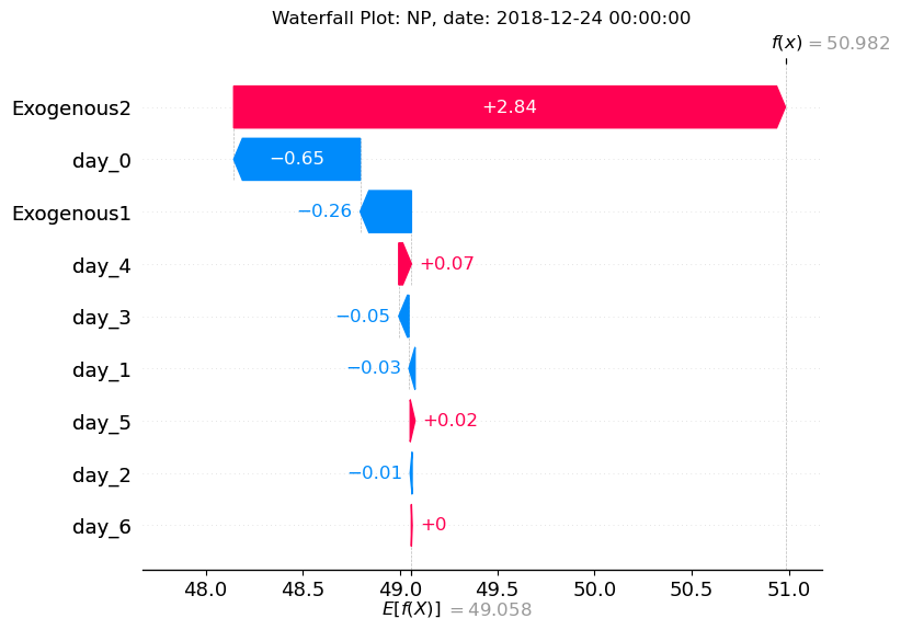
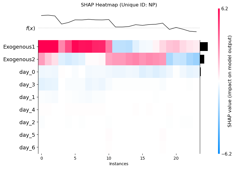
Heatmap
Visualize how feature impacts vary across each forecast step. This often reveals time-dependent effects of certain variables.