Brand Kit
Everything you need to represent Nixtla. Download logos, explore our typography, colors, and design system.
Our Logos


01
Clear Space
Always maintain a minimum clear space around the logo equal to the height of the 'N' in Nixtla.
02
Minimum Size
The full logo should not be rendered smaller than 120px wide. The icon should not be smaller than 32px.
03
Don'ts
Do not stretch, rotate, recolor, add effects, or place the logo on busy backgrounds that reduce legibility.
Type System
Primary
Aa Bb Cc Dd Ee Ff Gg
Functional
Aa Bb Cc Dd Ee Ff Gg
Supply Mono
Buttons, badges, eyebrow text
Heading Scale
Forecasting Engine
Time Series Models
Anomaly Detection
Real-Time Insights
Text Styles
SECTION TITLE
LABEL TEXT
Regular paragraph text used throughout the site. 16px, 130% line-height.
Supporting caption text with reduced opacity.
Color Palette
Light Theme
Dark Theme
Brand & Terminal Colors
Spacing & Layout
Design Rules
01
No Rounded Corners
The design system uses sharp corners on all cards, containers, and sections. The only exceptions are small UI primitives (pills, avatars, form inputs).
02
Border-Only Design
Dividers and cell boundaries use 1px solid borders with the semantic border-border color token. No shadows or gradients on structural elements.
03
Full-Bleed Sections
Content grids extend to viewport edges using the full-bleed utility. Inner content re-aligns using inner-padding.
04
Semantic Colors Only
Use CSS variable-based color tokens (bg-canvas, text-ink, border-border) instead of raw Tailwind color classes.
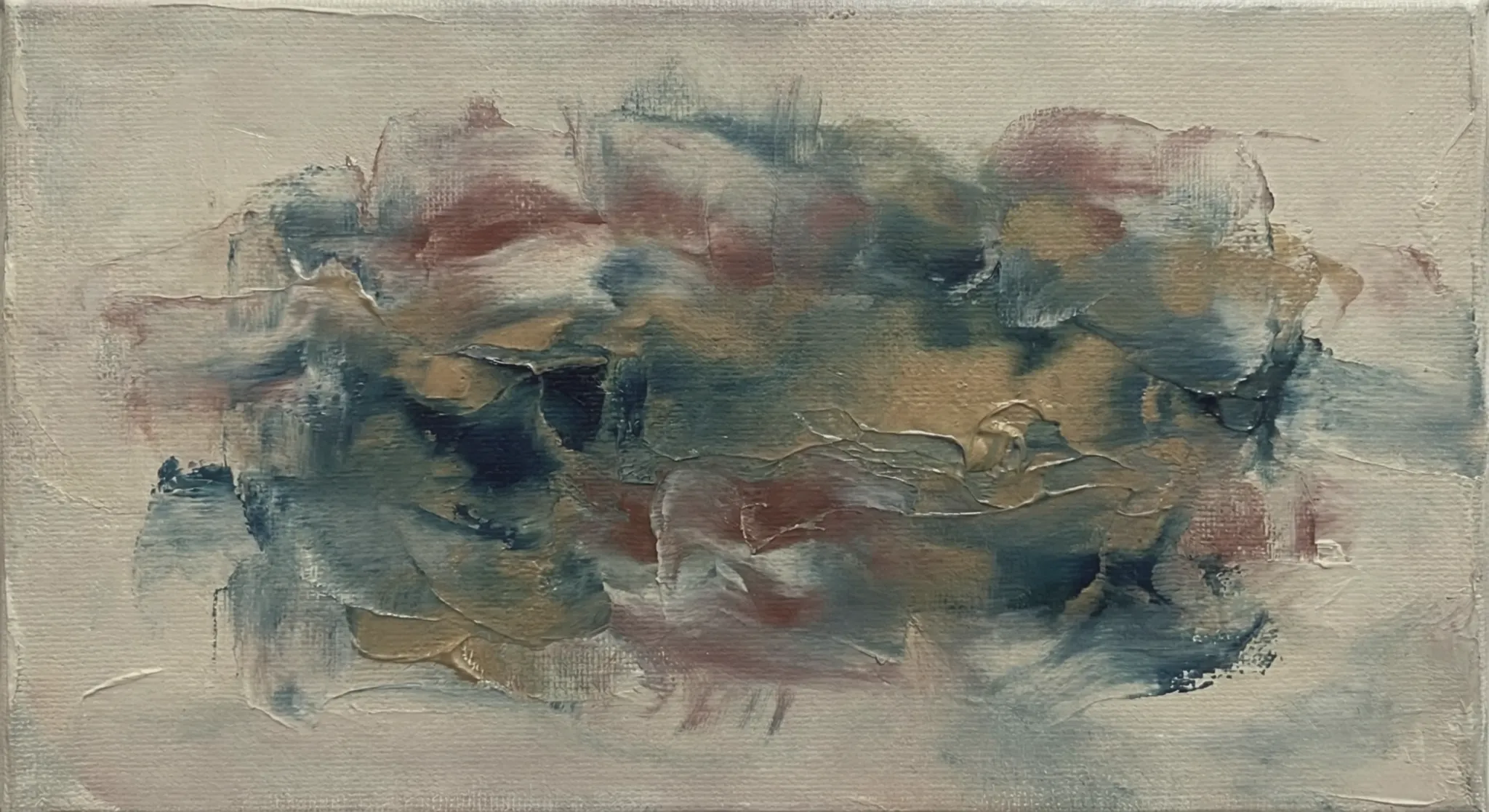
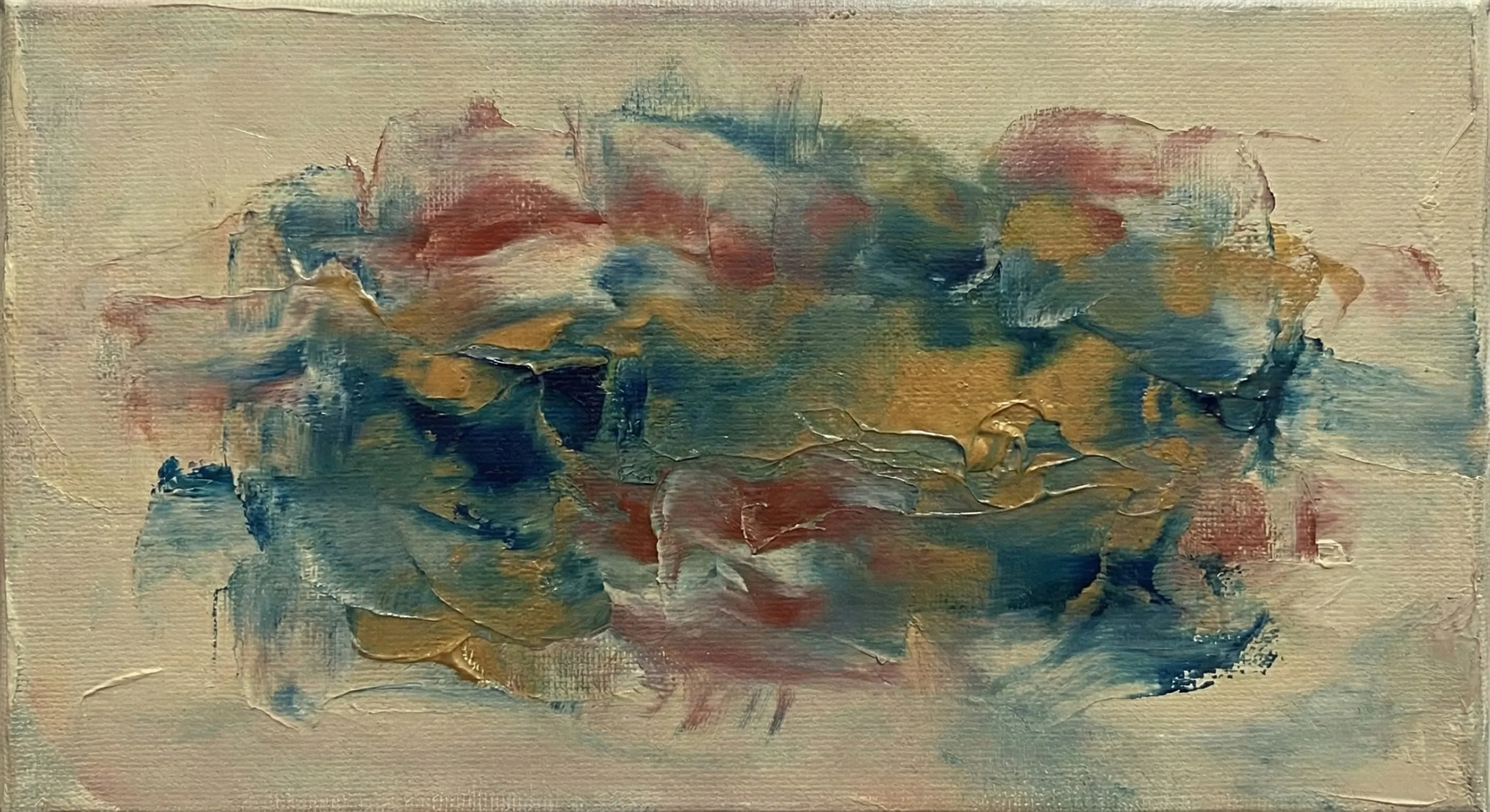
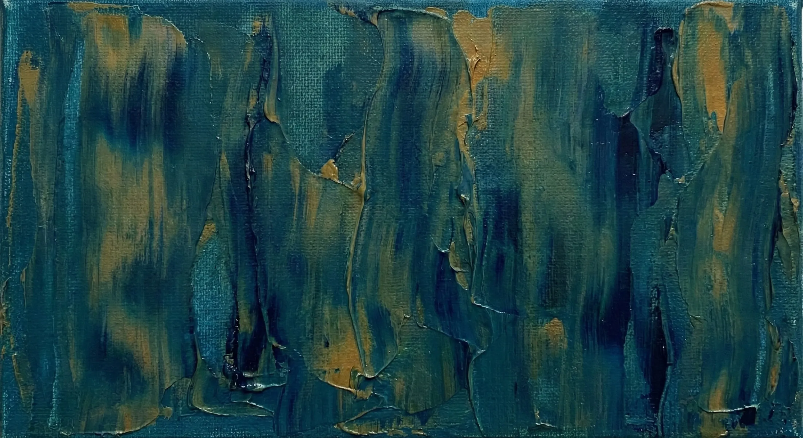
Background Textures
General


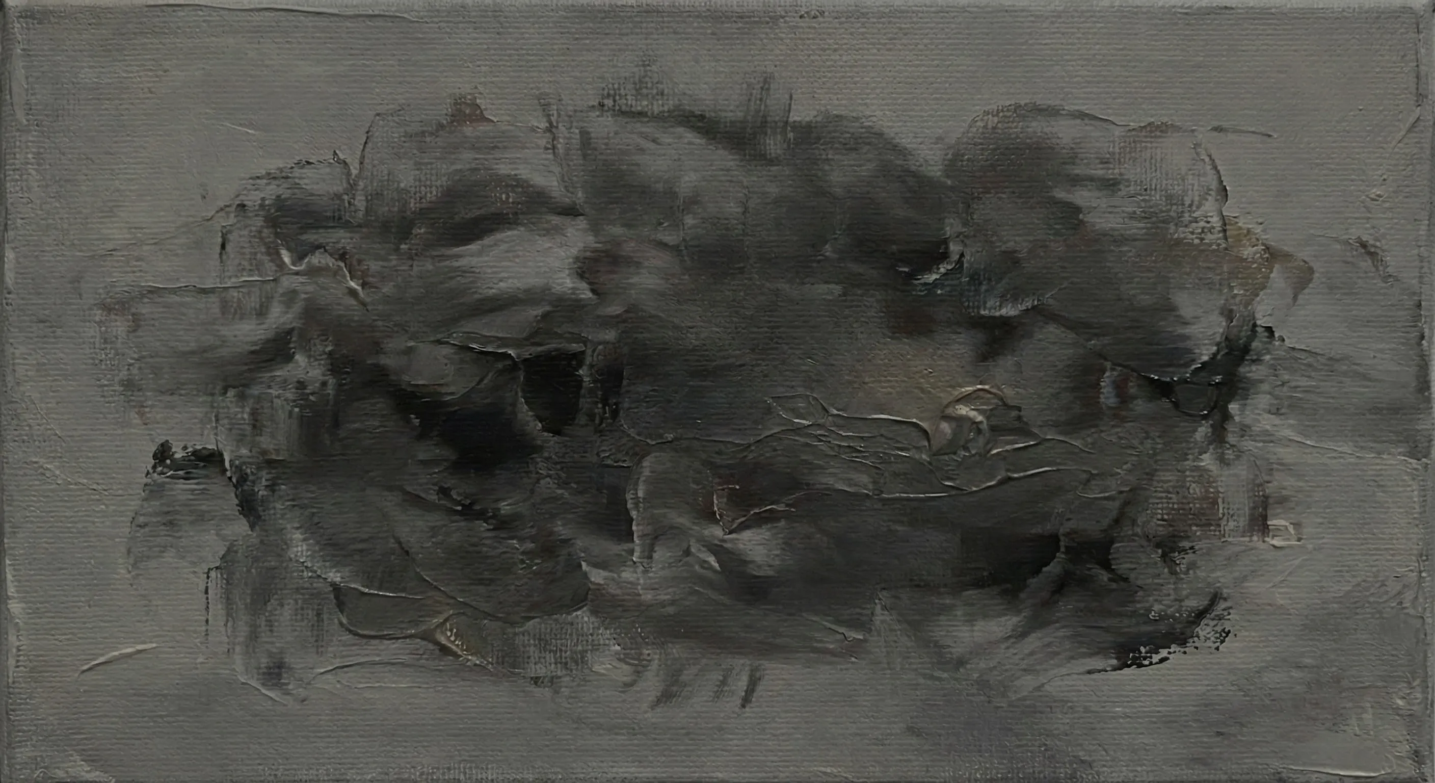


Chat & Terminal


Carousel


Use Cases