# Performance Evaluation of Anomaly Detection through Synthetic Anomalies
Canonical: https://www.nixtla.io/blog/anomaly-detection-performance-evaluation
Published: 2025-08-26
Let's say you have a time series and an anomaly detection algorithm to detect anomalies. If you have a labeled dataset, the performance of your anomaly detection algorithm can be measured using metrics like precision, recall, or F1-score. But what if your dataset doesn't include any labels, meaning you don't know where the anomalies are? How do you measure performance then?
## Synthetic Anomalies Detection
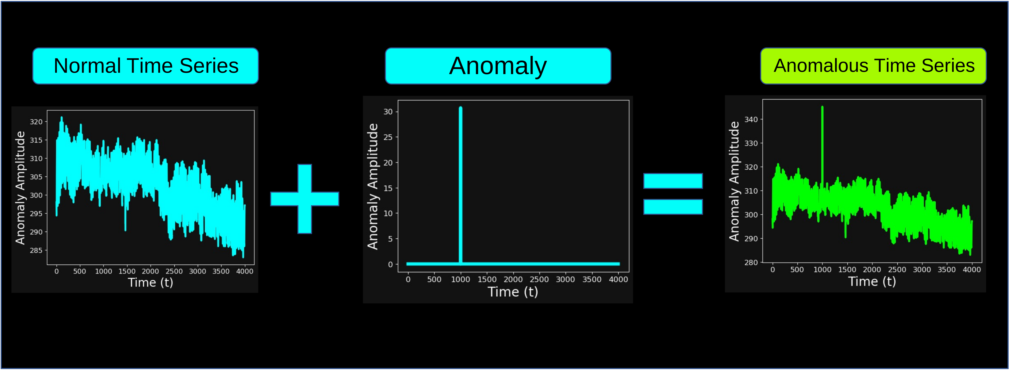
A way to assess the performance of your method is to manually inject **synthetic anomalies** into your time series. Anomalies can take many different forms. Throughout this article, we considered an anomaly to be a localized **spike** in the input time series, as shown in the image below:
A successful outcome of the anomaly detection algorithm is shown in the following image: the algorithm correctly identifies the point where the anomaly was injected.
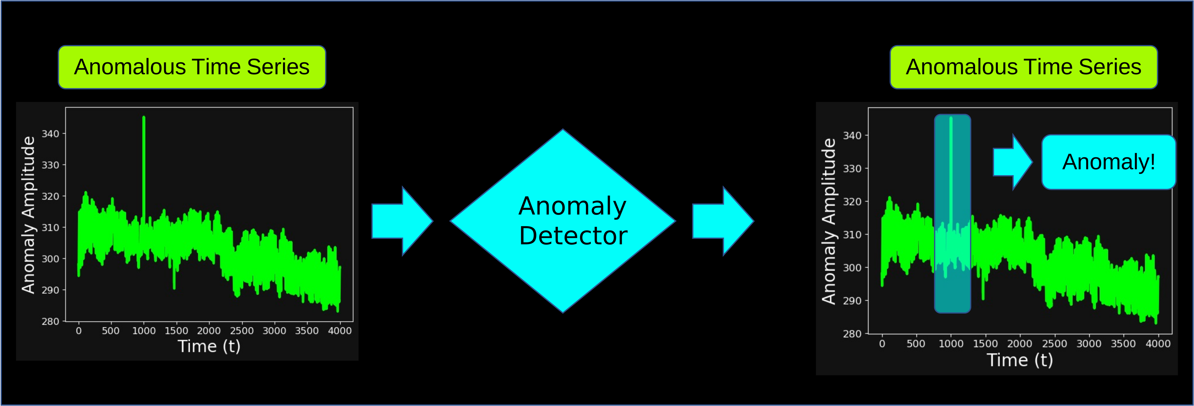
Of course, an unsuccessful outcome would be when the anomaly detector fails to identify the injected anomaly.
Because now we have a clear definition of what counts as successful or unsuccessful detection, **these synthetic anomalies can be used to build a labeled dataset.** This labeled dataset can then be used to train, validate, and benchmark anomaly detection models in a controlled and repeatable setting.
## Synthetic Anomalies Parameters
In the setup of synthetic anomalies, multiple **parameters** can influence anomaly detection:
1. The **kind** of injected anomalies: what do our injected anomalies look like?
2. The specific **anomaly detection algorithm** we are adopting: how are we detecting the anomalies?
3. The **size** of our anomalies: how "big" do we assume our anomalies to be?
4. The **location** of our anomalies in the time series: where is the anomaly in the time series?
The first two parameters (**kind** and **anomaly detection algorithm**) are fixed in this blog post.
As stated earlier, a reasonable assumption for the **"kind"** of anomaly is a localized **spike**. For example, in a weather dataset, where the amplitude (y-axis) represents temperature in Kelvin and the x-axis represents time in hours, the **spike** corresponds to a temperature that is significantly higher than average.
The **anomaly detection algorithm** that we will be testing is the [TimeGPT-1](https://www.nixtla.io/docs) model, developed by the [Nixtla](https://www.nixtla.io/) team. The idea behind TimeGPT-1 is to use the **transformer** algorithm and conformal probabilities to get accurate predictions and uncertainty boundaries. You can read more about it in the original [paper](https://arxiv.org/abs/2310.03589), while another application of anomaly detection through TimeGPT-1 can be found in this [blog post](https://www.nixtla.io/blog/anomaly-detection).
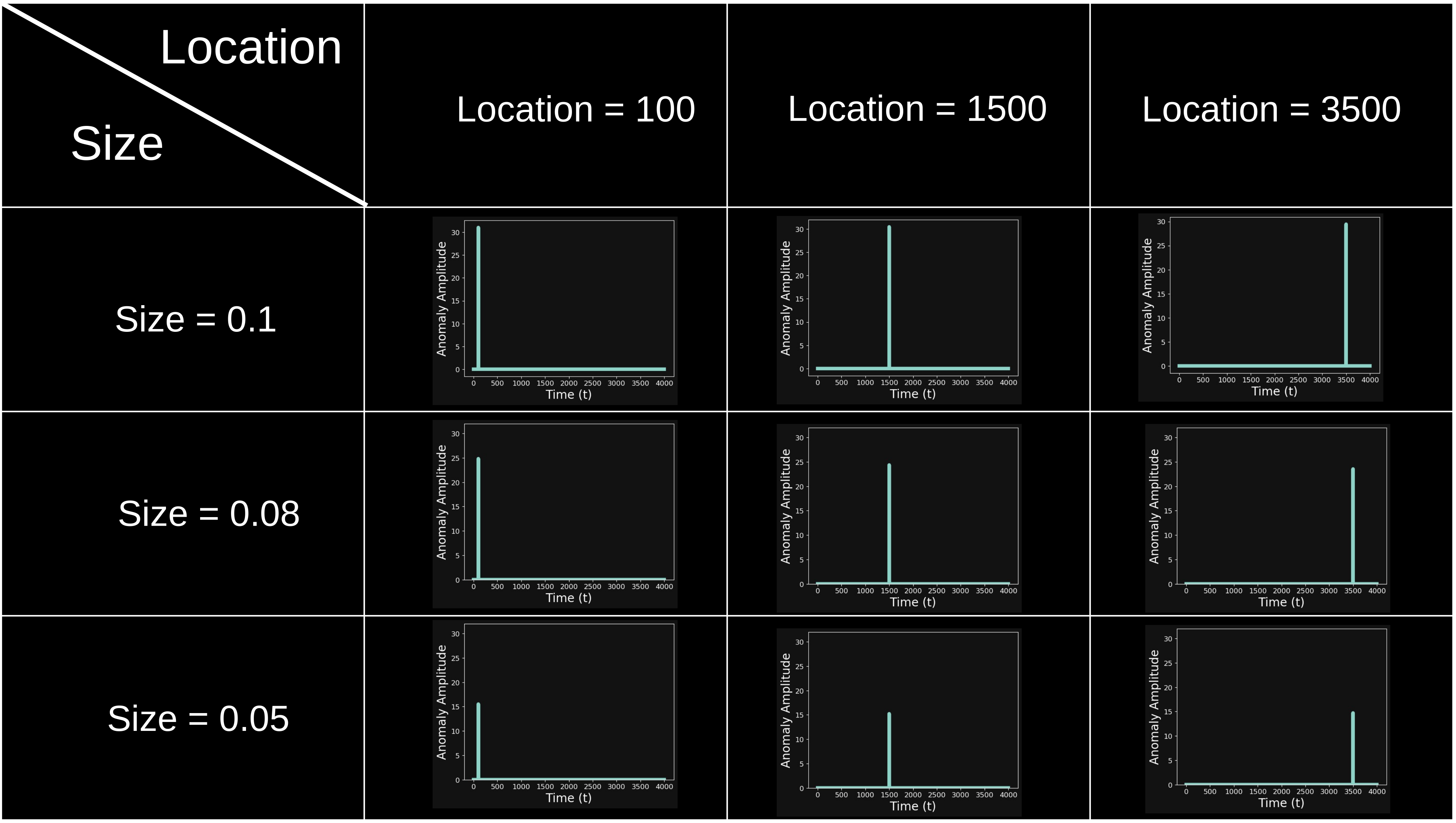
The **size** and **location** parameters are not fixed and will be considered as **variables**. A visual representation of injected anomalies at varying sizes and locations can be seen below:
And the corresponding effect on the input time series is shown below:

## Performance Evaluation Method
Now, if you think about it, when the anomaly size is huge, any anomaly detection model (even a very simple one) would be able to easily spot it. Nonetheless, when the anomaly size is almost zero, even a very powerful anomaly detection model would struggle to detect it.
The question we want to ask ourselves is the following:
**_"What is the smallest anomaly that we can detect through our algorithm?"_**
The evaluation algorithm to detect the smallest detectable anomaly, which we are going to define as the **minimum detectable anomaly**, is the following:
1. We fix the largest **size** of the anomaly (e.g. size = 0.1 × the average of the time series).
2. We inject the anomaly, using the same size, at **multiple locations** in the time series.
3. For each time series with an injected anomaly, we **run the anomaly detection algorithm** and check whether the anomaly at the injected location is detected.
4. We **measure performance** across all locations using a metric such as:
$$\text{Accuracy} = \frac{\text{Number of detected anomalies}}{\text{Number of anomalies}}$$
5. _If_ the accuracy is satisfactory, we can reduce the size of the anomaly and repeat from step 2. _If not_, we interrupt the loop.
A visual representation of this algorithm can be seen in the following flowchart:
```mermaid
flowchart TD
A[Select a fixed size s] --> B[Create dataset]
B --> C[Run the anomaly detection
on dataset]
C --> D[Measure the accuracy]
D --> E{accuracy > desired accuracy}
E -- No --> F[Reduce size s]
F --> B
E -- Yes --> G[Set Minimum Detectable
Anomaly = s]
G --> H[End]
```
At the end of this loop, the smallest size that yields satisfactory accuracy will be defined as the **minimum detectable anomaly**.
## Data Setup and Anomaly Injection
We are going to implement the Performance Evaluation's algorithm described above on a real world dataset. The dataset and all the scripts that you need to run the code below can be found in this [PieroPaialungaAI/AnomalyDetectionNixtla](https://github.com/PieroPaialungaAI/AnomalyDetectionNixtla) folder, which you can clone using:
```bash
git clone https://github.com/PieroPaialungaAI/AnomalyDetectionNixtla.git
```
The time series that we will be using come from the [historical hourly weather dataset](https://www.kaggle.com/datasets/selfishgene/historical-hourly-weather-data) on Kaggle. Note that you don't need to download anything, as the dataset is already available in the `RawData` folder.
In this dataset, the x-axis is the hourly recorded time, and the y-axis is the temperature, measured in K. The loader for this dataset can be found in the [data.py](https://github.com/PieroPaialungaAI/AnomalyDetectionNixtla/blob/main/data.py) script. The dataset provides multiple time series as columns (i.e., one column per city). For example, the last entries for the time series for `Denver` look like this:
```python
from data import *
data = Data(datetime_column='datetime')
data.raw_data[['Denver', 'datetime']].tail()
```
| Index | Denver | datetime |
| ----- | ------ | ------------------- |
| 45248 | 289.56 | 2017-11-29 20:00:00 |
| 45249 | 290.70 | 2017-11-29 21:00:00 |
| 45250 | 289.71 | 2017-11-29 22:00:00 |
| 45251 | 289.17 | 2017-11-29 23:00:00 |
| 45252 | 285.18 | 2017-11-30 00:00:00 |
Multiple preprocessing steps are now applied:
1. We only deal with one time series, so we can pick the city. The default city (selected throughout the blog post) is `Phoenix`, but the `isolate_city(city)` allows you to pick whatever city you like.
2. The time series is pretty long, so we isolate a portion of the time series to reduce time and power complexity. The default portion is between `index = 41253` and `index = 45253`. Again, feel free to change this however you'd like using the `isolate_portion(start,end)` function. Keep in mind that the full time series has length `l = 45253` (so don't exceed the boundaries)
3. In order to run our `TimeGPT-1` model on `Nixtla`, the last preprocessing step is to rename the datetime columns to `ds` and the timeseries amplitude to `y`.
```mermaid
flowchart TD
A[Start Preprocessing] --> B[Select a single time series
city]
B --> C[Isolate a portion of the
time series]
C --> D[Rename columns:
datetime → ds,
y-value → y]
D --> E[Preprocessed data ready
for TimeGPT-1]
```
The entire data preprocessing pipeline can be run using the following block of code:
```python
data.isolate_city()
data.isolate_portion()
preprocessed_data = data.prepare_for_nixtla()
preprocessed_data.head()
```
| Index | y | ds | unique_id |
| ----- | -----: | ------------------- | --------- |
| 0 | 297.96 | 2017-06-16 09:00:00 | 0 |
| 1 | 297.15 | 2017-06-16 10:00:00 | 0 |
| 2 | 295.80 | 2017-06-16 11:00:00 | 0 |
| 3 | 295.00 | 2017-06-16 12:00:00 | 0 |
| 4 | 294.33 | 2017-06-16 13:00:00 | 0 |
This is the `preprocessed_data` that we will use for the rest of the blog post.
Everything related to anomaly injection and detection is implemented in the `AnomalyCalibrator` class. Its input is the `preprocessed_data` object, which is the result of the data processing steps from the `Data` class described above:
```python
from anomaly_calibrator import *
anomaly_calibrator = AnomalyCalibrator(processed_data = preprocessed_data)
```
The `inject_anomaly` function allows us to place an anomaly of any size (`threshold`) wherever we like (`location`). For example, we can inject an anomaly at location = 300 with size = 0.1 (times the time series average in a small window around location = 300) using the following line of code:
```python
anomaly_data = anomaly_calibrator.inject_anomaly(location = 300, threshold = 0.1)
plot_normal_and_anomalous_signal(anomaly_data['normal_signal'], anomaly_data['anomalous_signal'])
```
```chart
{
"id": "chart-1",
"title": "Normal vs Anomalous Signal Comparison",
"dataSource": "chart-1.csv",
"xAxis": {
"key": "ds"
},
"yAxis": {
"label": "Temperature [y]"
},
"series": [
{
"column": "normal_signal",
"name": "Non anomalous signal",
"type": "line",
"zIndex": 5
},
{
"column": "anomalous_signal",
"name": "Anomalous signal",
"type": "line",
"zIndex": 3
}
]
}
```
```chart
{
"id": "chart-1-2",
"title": "Normal vs Anomalous Signal Comparison",
"dataSource": "chart-1-2.csv",
"xAxis": {
"key": "ds"
},
"yAxis": {
"label": "Temperature [y]"
},
"series": [
{
"column": "difference",
"name": "Difference",
"type": "line"
}
]
}
```
The plot shows the use of the anomaly injector function:
- The top subplot shows a clean time series (white) and the same time series with a synthetic anomaly injected (lime). The two timeseries are completely superimposed except for the sharp spike added around time index 500, clearly standing out from the regular pattern.
- The bottom subplot visualizes the absolute difference between the two signals (cyan), with a large peak at the injection point.
The anomaly detector should detect the injected anomaly shown in the bottom subplot.
For a fixed anomaly size, we can generate `num_location` time series, each with the same anomaly `size` injected at a different location, using `build_anomalous_dataset`:
```python
anomaly_calibrator.build_anomalous_dataset(num_location = 20)
anomaly_calibrator.plot_anomalous_dataset()
```
```chart
{
"id": "chart-2",
"title": "Multiple Anomalous Signals",
"dataSource": "chart-2.csv",
"xAxis": {
"key": "time_step"
},
"yAxis": {
"label": "Temperature [y]"
},
"series": [
{
"column": "signal_1",
"name": "Signal",
"type": "line"
}
]
}
```
The plot shows multiple time series (cyan), each with an anomaly of the same size injected at a different location. All series are superimposed to visualize the variety of injection points, so you don't really see the difference **except** the visible spikes scattered across the timeline, clearly illustrating how the same anomaly size can manifest differently depending on where it occurs in the time series.
## Anomaly Detection with TimeGPT
To use the [TimeGPT-1](https://www.nixtla.io/docs) anomaly detector, we will need to load Nixtla's API. To do that, we need to have an API key in the first place. You can get one following the [API key setup instructions](https://www.nixtla.io/docs/setup/setting_up_your_api_key). Once you have your API Key, store it in your system using:
```bash
export NIXTLA_API_KEY = "your_api_key"
```
And import your Nixtla client using:
```python
anomaly_calibrator.load_nixtla_client()
```
Let's take the anomaly detection out for a spin. For example, let's see how the algorithm performs for `location = 800` and `size = 0.05`.
```python
location = 800
threshold = 0.05
anomaly_data = anomaly_calibrator.inject_anomaly(location = location, threshold = threshold)
test_signal = anomaly_data['anomalous_signal']
anomaly_calibrator.run_anomaly_detection(test_signal)
ds_anomaly = preprocessed_data['ds'].loc[location]
anomaly_result = anomaly_calibrator.anomaly_result
anomaly_result[anomaly_result['ds'] == ds_anomaly]
```
INFO:nixtla.nixtla_client:Validating inputs...
INFO:nixtla.nixtla_client:Preprocessing dataframes...
INFO:nixtla.nixtla_client:Calling Anomaly Detector Endpoint...
| Index | unique_id | ds | y | TimeGPT | TimeGPT-hi-99 | TimeGPT-lo-99 | anomaly |
| ----- | --------- | ------------------- | --------- | --------- | ------------- | ------------- | ------- |
| 664 | 0 | 2017-07-19 17:00:00 | 320.59795 | 304.36893 | 309.00305 | 299.73480 | True |
As we can see, the anomaly detection model correctly identifies the location where the anomaly was injected. Even visually, it's clear that the model successfully detects the anomaly, as shown below:
```python
anomaly_calibrator.plot_anomaly_detection()
```
```chart
{
"id": "chart-3",
"title": "Time Series with TimeGPT Predictions and Anomalies",
"dataSource": "chart-3.csv",
"xAxis": {
"key": "ds"
},
"yAxis": {
"label": "Target [y]"
},
"series": [
{
"column": "y",
"name": "Actual Data",
"type": "line",
"color": "zinc-100",
"zIndex": 4
},
{
"column": "TimeGPT",
"name": "TimeGPT Prediction",
"type": "line",
"color": "cyan-400",
"zIndex": 5,
"strokeDashArray": "5,5"
},
{
"type": "area",
"columns": {
"high": "TimeGPT-hi-99",
"low": "TimeGPT-lo-99"
},
"name": "99% Confidence Interval",
"color": "cyan-600"
}
],
"anomalies": {
"column": "anomaly",
"seriesColumn": "y"
}
}
```
The plot shows the results of TimeGPT’s anomaly detection:
- The white line is the actual signal
- The cyan line represents TimeGPT’s prediction
- The cyan shaded area is the 99% confidence interval.
- The green dot marks the detected anomaly.
The spike falls well outside the prediction range, so it is detected as an **anomaly** by the model (green dot). This is very promising, considering that the injected anomaly is only 5% (0.05) of the average value of the time series.
## Performance Evaluation Implementation
The following code runs the full loop described in the **_Performance Evaluation Method_** section.
To execute the algorithm, we need to specify a desired accuracy, which is the minimum accuracy we want to achieve. For example, we can say that the algorithm is "satisfactory" as soon as it is better than flipping a coin. This would mean a desired accuracy of 0.5. If we fix this value, we obtain the following result.
```python
calibration_dict = anomaly_calibrator.calibration_loop(number_of_runs = 20, desired_accuracy = 0.5)
```
The accuracy for size 0.1 is 1.0
The accuracy for size 0.09 is 1.0
The accuracy for size 0.08 is 1.0
The accuracy for size 0.07 is 1.0
The accuracy for size 0.06 is 1.0
The accuracy for size 0.05 is 1.0
The accuracy for size 0.04 is 0.95
The accuracy for size 0.03 is 1.0
The accuracy for size 0.02 is 0.8
The accuracy for size 0.01 is 0.1
The accuracy for size 0.01 is 0.1, which is lower than the desired accuracy 0.5
The minimum detectable anomaly is 0.02
The results here are quite impressive: for a very small anomaly (2% of the average value of the time series), we still achieve an accuracy of 0.8, well above our desired threshold. Nonetheless, 0.8 is still more than the desired accuracy, so the minimum detectable anomaly is even smaller than size = 0.02.
If we run the full loop again, this time starting with a smaller size = 0.02, we will be even more precise in determining our **minimum detectable anomaly**, as shown below:
```python
from anomaly_calibrator import AnomalyCalibrator
anomaly_calibrator = AnomalyCalibrator(processed_data = preprocessed_data, largest_threshold_size = 0.02, step_threshold = 0.001)
anomaly_calibrator.load_nixtla_client()
refinement_calibration_dict = anomaly_calibrator.calibration_loop(number_of_runs = 20, desired_accuracy = 0.5)
```
The accuracy for size 0.02 is 0.7
The accuracy for size 0.019 is 0.8
The accuracy for size 0.018 is 0.7
The accuracy for size 0.017 is 0.65
The accuracy for size 0.016 is 0.45
The accuracy for size 0.016 is 0.45, which is smaller than the desired accuracy 0.5
The minimum detectable anomaly is 0.017
So, by refining our evaluation, we find that the minimum detectable anomaly, for desired accuracy = 0.5, is around 0.017.
## Conclusions
In this article, we presented an effective method to evaluate the performance of anomaly detection algorithms when labeled data is not available using **synthetic anomalies**. In particular, we did this:
- We introduced a method to evaluate anomaly detection performance without labeled data by injecting synthetic anomalies.
- The method involves systematically decreasing anomaly size and measuring detection accuracy.
- The smallest anomaly size with an acceptable accuracy value is defined as the **minimum detectable anomaly**.
- We applied the method on real-world weather data using **Nixtla’s TimeGPT-1** model and found reliable detection even for small anomalies.